Latin Phrases app good for
et bene valeat. L. da Vinci signed off his letters this way. Find out what it means.
This is a handy app to have around. I have found it very useful.
Im having a lot of fun with this. Well done to the creator (of the app)! One "must have" thats missing is the ability to forward a chosen phrase via email/twitter etc. as one finds in other apps (unless I missed it). One "nice to have" would be a section with more current expressions available in Latin (silly things like "git er done", "whatever" etc.). This is not essential, but might be worth a try just for fun. Still, I do like this app a lot.
Fun to study, fun to make a surprise tweet or subject email message. Easy to use. Glad I bought it.
Just about any Laton phrase you want to know. A great resource and easy to use.
Perfect for looking up Latin Phrases encountered while reading
Some bad moments
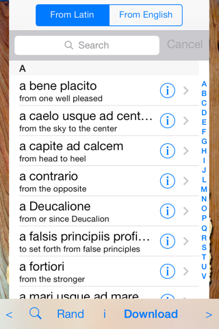
I like the idea for this application, but it has two flaws that bother me. First, the search function only seems to work for the Latin phrase, but not any words in the descriptive text. If youd like to search for a word you know and see if it applies to a Latin phrase, youre out of luck.
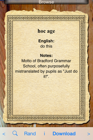
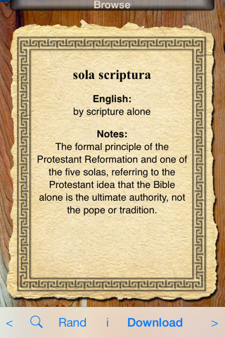
Second, a number of the descriptions are truncated. The paragraph gets abruptly cut off after a certain character count, so you cant read the whole thing. Thats a pretty major failure by itself.
I know its only 99ยข, but they could give it a little more effort for quality control.
nice interface...however, it would be greatly improved if u were able to share....
This app has peculiar limitations. For example, in the index, translations display in their entirety. But when you open the entry itself, the translation is truncated to roughly 47 characters in portrait mode or 77 characters in landscape mode (on the iPad), which cuts some definitions off prematurely. So the information is there, but doesnt always display. Similarly, "notes" are truncated to about 250 characters (regardless of orientation), often ending mid-word. Theres plenty of empty space on these pages, so I dont know why the content is so chopped up. On the iPhone, there is no landscape orientation for the index, and the entries just rotate 90 degrees, maintaining their original width (with white space filling the right side). As a free app, this would be okay; but I cant recommend paying for this in its current state. (Note: The links to the developer website and support page do not work either.)
I had been very happy with the previous version of this. About a week ago (2/3/12) an updated version was available and I downloaded it. Since that time, the photo of the coliseum appears as the app, but nothing will begin when its tapped and I just go back to the apps screen. Ive tried removing and redownloading. Nothing works.
You alert new customers that the new version is out and the old one THIS ONE may VANISH. I have purchased numerous apps from you. To think you will punish existing customers by vanishing a product you offered and was purchased in good faith says a lot about you. You should offer a credit or proper update to existing owners of this app to transfer over to "Pro" at no extra cost. I just purchased another app from you and now I wish I hadnt. This bait and switch tactic will be plastered all over app boards by next week I assure you. I hate liars and cheats. Caveat emptor!!!